Applying some simple design principles to your resume goes a long way to grabbing an employer’s attention and landing you the job.

Gathering all the relevant information about your experience is one thing; laying out it properly is another. When employers are trawling through dozens of candidates’ resumes, you want to capture their attention and give yourself the best chance of being noticed. Applying some hierarchy-related design principles to your resume is a great way to stand out from the crowd.
It sounds obvious, but the larger something is on a page, the quicker our eyes gravitate towards it. A lot of resumes will feature the applicant’s name as the largest text, but this isn’t the most important element in the document. Think about what you want to highlight and what you want an employer to see first when they open your resume, and consider making this the largest heading. There’s a good chance that the most important part of your resume will be the experience section, though this can change depending on the employer or the available role.
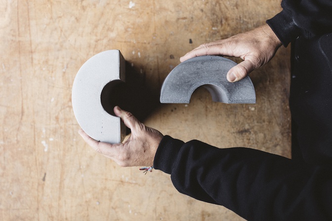
If you don’t have a lot of room to play with, changing the shape of important elements is another effective way to make things stand out. If you have information housed in square tables or boxes and want to highlight something important, consider placing it in a circle or other shape. People naturally focus on irregularities in design, whether it’s shape or size.
Having consistency in your resume design is an excellent way to keep an employer engaged with your CV and ensure a smooth reading experience. For information that repeats – such as experience or skills – consider building a set layout and apply it consistently. For example, for prior experience, list the organisations and company logos with the dates in brackets, then three dot points outlining skills gained in that position. This way your skill set will stand out clearly to an employer and read smoothly.
Size, shape and pattern are all important, but they don’t exist without breaks. Employers will almost certainly overlook resumes laid out with large slabs of information, so spacing is important even at first glance. Once someone is giving your resume more attention, breaks and spaces subconsciously tell them where to pause, how much information to absorb at a time and which elements belong together. It sounds simple, but spacing out your resume correctly goes a long way towards ensuring an employer gives their full attention to your application, helping you land the job.
Photography: Katrina Parker
There are a few good resume-building tools available online, such as Canva, Resume Genius and Zety. Once you’ve set your resume out perfectly, you can search for your next job on Scout.


